the WhatsAppone of the most popular messaging apps in the world, continues to evolve and offer new features to its users.
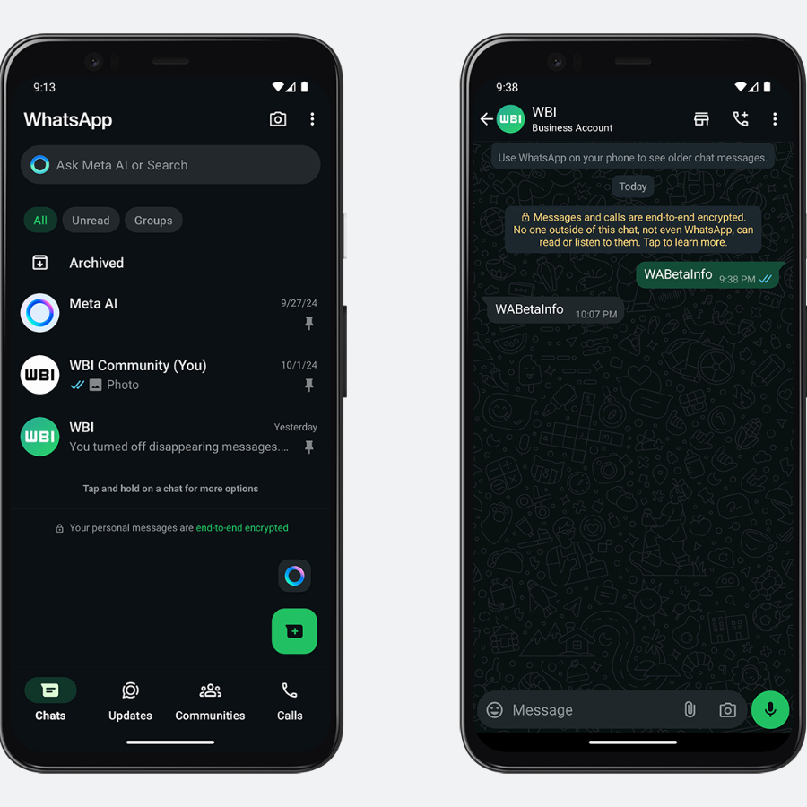
In the latest Android beta version, 2.24.22.4, the app introduced a deep dark theme, in response to long-standing user request.
The new option promises a more enjoyable visual experience, especially in low-light environments, in addition to a modern and improved aesthetic.
This update, which is available to some beta users, represents an evolution in the design of WhatsApp, which already introduced a dark theme.
However, the new option goes further, changing the background and other visual elements to a much deeper black, abandoning the gray tones that characterized the previous version.
The main color of the facade now goes from #0b141a to #0a1014, a shade approaching absolute black, but with a slight bluish tint.
Visual comfort and less eye fatigue
The main goal of this change is to provide greater visual comfort, especially for those who use the app at night or in low-light environments.
the Deep dark theme reduces screen brightnesswhich reduces eye strain, something often reported by users of the default dark theme.
With the new coloring, the received message bubbles are darker, improving readability and immersion in conversations.
In addition to the wallpaper and chat bubbles, other interface elements have also undergone changes, such as new message buttons.
This ensures an aesthetic uniformity that, according to experts, also follows contemporary design trends, which favor more sober and deeper colors, as seen in applications and other digital platforms.


WhatsAppa introduced the beta version for Android, 2.24.22.4 – Image: WABetaInfo/Reproduction
Availability
Although the function is still in the testing phase, and is gradually being released to more beta users, it is expected that it will reach the stable version of WhatsApp in the coming weeks.
For those who have already installed version 2.24.22.4, but haven’t seen the new look yet, they’ll have to wait, as the feature is rolling out in waves.
According to reports from beta testers, this new color palette is especially effective for those who use WhatsApp for long periods, and provides not only convenience but also a sense of customization.
WhatsApp has already made progress in allowing more robust customization of chats, allowing the selection of different themes and colors for specific chats. The deep dark theme seems to be another step in this direction.
This update is a direct result of feedback from users, who have long asked for a more realistic dark theme option, with fewer shades of gray and more emphasis on pure black.
In addition to improving aesthetics and visual comfort, the change also highlights the importance of listening to the community to improve the in-app experience.
In addition to the dark appearance, Other features are being tested in the beta versionsuch as new color options and themes for one-on-one chats, expanding the level of customization.
These modifications indicate that WhatsApp is committed to providing an increasingly customizable experience that remains compatible with the preferences of millions of its users.
*With information from WABetaInfo and Tudo Celular.


![[VÍDEO] Elton John’s final show in the UK has the crowd moving](https://www.lodivalleynews.com/wp-content/uploads/2023/06/Elton-John-1-690x600.jpg)

More Stories
What ChatGPT knows about you is scary
The return of NFT? Champions Tactics is released by Ubisoft
What does Meta want from the “blue circle AI” in WhatsApp chats?